
Mission Society "Gradient Heart" Rebrand

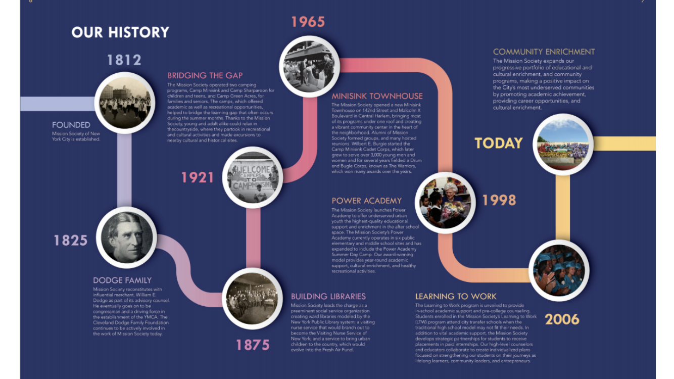
Rebranding 200+ years of storied history
Objective: Partner with executive leadership at the Mission Society of NYC to architect a colorful, modern brand identity system that aligned with the organization's mission to light the way for equity in education.
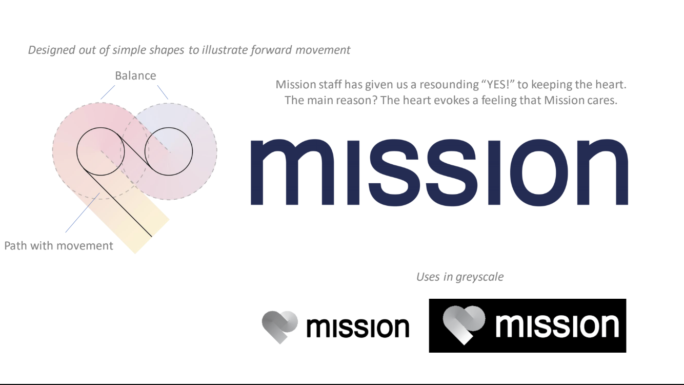
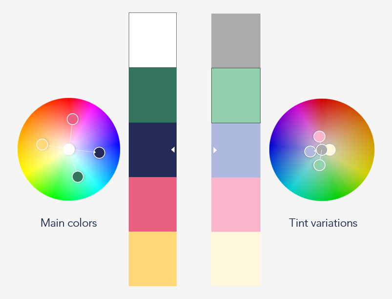
Vision: Reimagine the adored Mission 'heart' with colors better suited to it's education, nonprofit, and Harlem roots; and incorporate the feeling of movement in the brand shape and textures.
Strategic objectives
Visualize movement: Create a sense of dynamism within the logo.
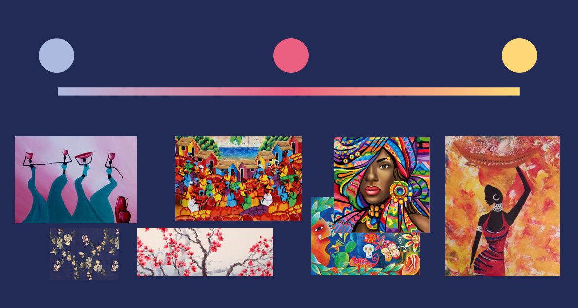
Represent the community: Colors taken from artistic works representative of the community served. Colors, shapes, and typography should be original and inspired by the Harlem community.

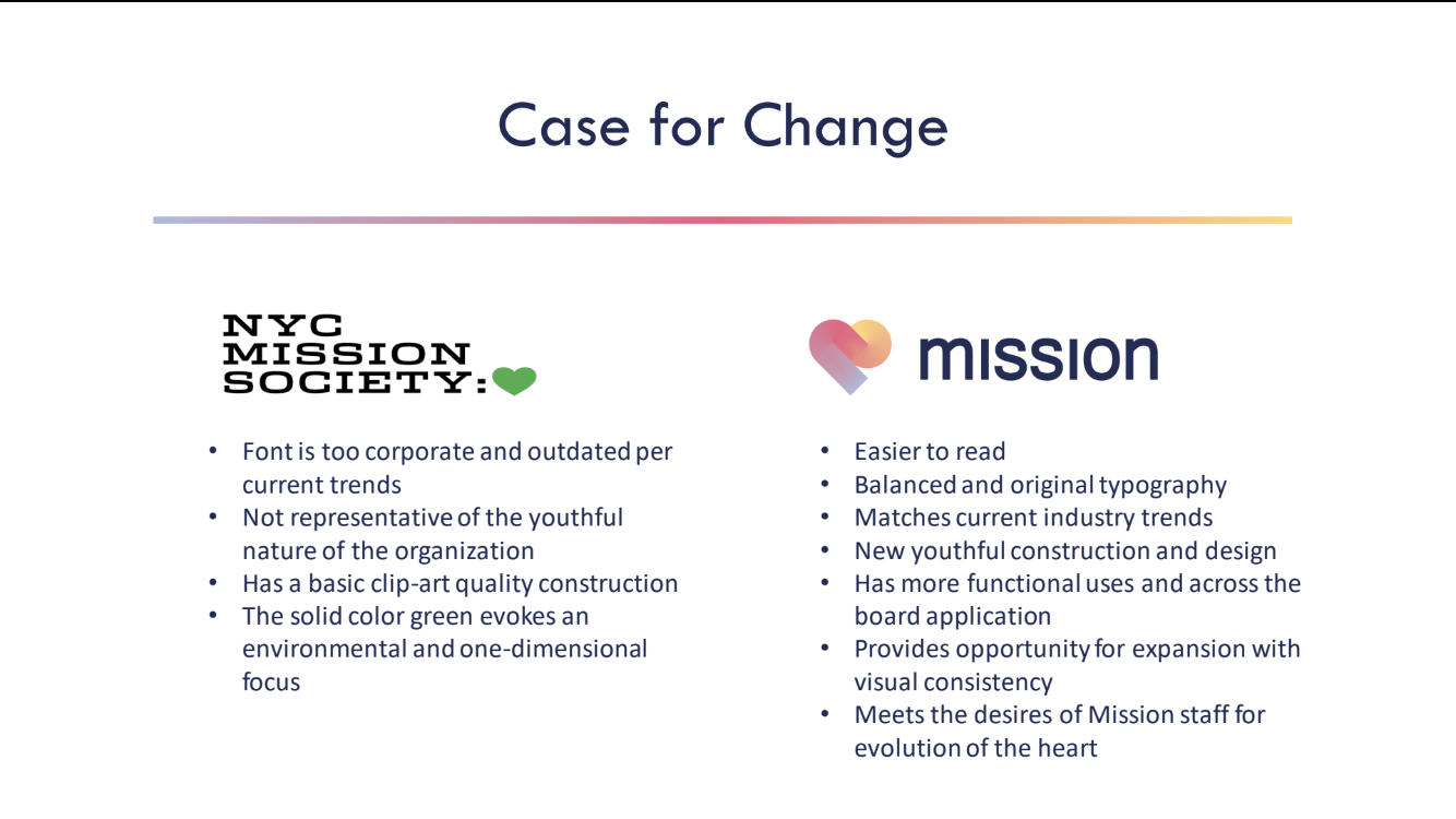
Thesis: Maintain the "heart' that demonstrates the organization's love and support for it's community, but with a modern feel that is differentiated but also aligned with the nonprofit, educational sector.
Strategy: A study of color, iconography, and typography was enacted, with select references assembled into mood boards and then reviewed with select stakeholders on the brand engagement team.
Approach: Drawing from the top selections, the classic heart brand symbol was recreated with new colors and simple shapes to evoke movement. It is then paired with original typograph to create a new logo and brand system. To reach approval, a pitch deck is created with select deliverables and presented to leadership for executive and board approval. To finalize the project, the approved brand system is presented to additional key organization stakeholders.
Deliverables
Rebrand pitch deck
Brand system: Logo, colors, gradient texture
Letterheads
Digital email signature
Multi-page website
Print suite: Business cards, annual report
Product mockups
Experience similar transformation
Let's talk about your next project and how we might work together.